Choosing Exterior Paint Colors That Survive Riverside Sun
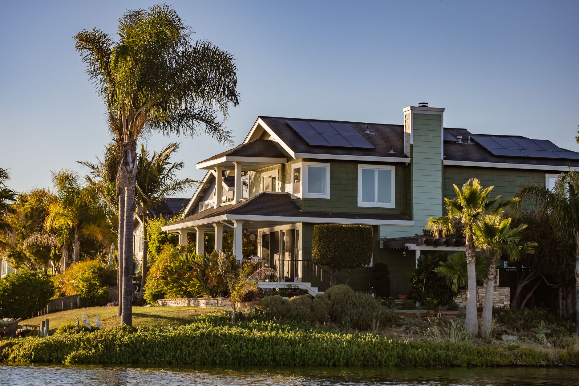
Paint chips are judged indoors, under a store light, at arm's length. A Riverside wall gets judged in a different way: from the street, in flat midday glare, and again at dusk, season after season. The colour that looked calm on a two inch card can turn loud across a whole stucco elevation, and a shade that looked safe can chalk and fade within a few summers. Picking exterior paint for this city means thinking about sun first and taste second.
Why does the sun change a colour so much?
Riverside sits inland, away from the coastal marine layer that softens light closer to the ocean. Summer sun here is high, white and long. Ultraviolet light breaks down the binder that holds pigment in a paint film, and the pigment is what fades once the binder lets go. Some pigments are far more stable than others. Dark reds, deep blues and bright yellows built from organic pigments tend to fade first, while earth tones built on iron oxide pigments hold their depth longer.
A painter can often tell a house's history from the way it faded. The south and west walls lose colour first because they take the afternoon sun. A shaded north wall can look like a different paint next to them. When a repaint uses a stable colour, the difference between walls stays small for years.
Light colours versus dark colours on stucco
Dark paint absorbs heat. On a stucco wall in July, a deep charcoal or chocolate surface can run much hotter to the touch than a pale cream beside it. That heat stresses the film, speeds up expansion and contraction, and shows every hairline crack in the stucco as a dark line. Pale and mid-tone colours reflect more light and keep the wall cooler. This is why so many older Riverside homes sit in sand, tan, soft grey and warm white, and why those colours keep looking decent after years of weather.
A dark colour is still possible. It works best on trim, doors and accents where the area is small and the surface can be a durable enamel. A whole house in a dark shade is a bigger commitment, and the maker's own light reflectance value, printed on the back of most colour cards, is the number to check. A higher reflectance value means the colour bounces more light and builds up less heat.
Which sheen belongs where?
Sheen affects both looks and durability. A flat finish hides surface flaws and is common on ceilings and on rough stucco, where a glossy film would highlight every bump. Eggshell and satin sit in the middle and clean more easily. Semi gloss and gloss repel dirt and water best and suit doors, window trim, fascia and garage doors, where scuffs and moisture collect.
| Surface | Usual sheen | Reason |
|---|---|---|
| Stucco walls | Flat or low sheen | Hides texture and patching |
| Smooth siding | Satin | Sheds dirt, easy to wash |
| Window trim and fascia | Semi gloss | Takes weather and handling |
| Front door | Semi gloss or gloss | Wipes clean, resists scuffs |
| Eaves and soffits | Flat | Reduces glare, hides dust |
| Garage door | Satin or semi gloss | Handles heat and wear |
Higher sheen shows imperfections, so prep has to be better under it. A satin on poorly sanded trim looks worse than a flat on the same trim.
How does texture change the colour you see?
A rough sand-finish stucco throws tiny shadows. Those shadows darken the overall appearance of a wall compared to the smooth paint card. A light colour on heavy texture reads one step deeper than the sample. Smooth fibre cement or wood siding does the opposite and shows the colour at its true value. It helps to look at a painted sample board on the actual wall, not a card held against it, and to look at it in morning, noon and evening light.
Most painters will brush out a sample two or three feet across. Let it dry fully before judging, since many paints shift a shade as the water leaves the film. Check it near the roof line, near the ground and next to any brick, stone or roof tile that will stay unpainted. A neighbouring surface changes how a colour reads.
Matching the surroundings without copying them
Riverside has plenty of reference points. The pale limestone and tile of the Mission Inn, the muted tones along the slopes of Mount Rubidoux, the dry grass and sage colours of the foothills toward the Box Springs Mountains, and the green of the Santa Ana River corridor all suggest a palette that fits the land. Homes near Fairmount Park often carry older paint schemes that blend into mature trees. Borrowing a few of these natural tones keeps a house from looking out of place without cloning the neighbour.
Roof colour, window frames, garage doors and any stonework are fixed. A body colour should be picked to work with them, and the trim chosen to separate the window frames from the wall. One accent colour is usually enough. A front door in a deeper tone gives the house a focal point without repainting the whole facade.
What about the paint itself?
Colour is half the decision, and the product underneath is the other half. Exterior acrylic latex paints are the standard on stucco, since they flex with the wall and breathe moisture. A paint labelled for exterior use should list UV resistance and mildew resistance on the can. Premium lines put more binder and better pigment into the same can, which is why a thicker, better paint covers better in two coats and holds colour longer. A thin paint may need a third coat to hide the old colour, which cancels the saving.
Elastomeric coatings are a separate category. They go on thick, bridge hairline cracks and shed water, and they are sometimes used on stucco that has a lot of fine cracking. They trap more moisture than ordinary acrylic when applied wrongly, and they are hard to recoat later with other products, so a painter should explain why one is being proposed and what it will be compatible with in the future.
Primer, and when a colour change needs one
Going from a dark colour to a light one usually calls for a tinted primer, since light paint over deep paint can need extra coats to cover. Going the other way is easier, though bare patches still need primer. A tinted primer close to the final colour helps the topcoat cover evenly, which matters more on a rough surface that is hard to roll uniformly.
Raw stucco and new patches are porous and absorb paint unevenly. A coat of masonry primer evens the suction, so the finish coat does not dry with dull and glossy patches. Skipping that step is the usual reason a repaint looks blotchy in raking afternoon light.
Timing and the weather window
Dark colours and hot walls do not go together at application time either. A wall baking in direct sun can flash the paint dry before it levels. Painters often work colours of a dark base on the shaded side of the house in the morning, and move around as the sun moves. Autumn Santa Ana winds can blow grit into wet paint, so a windy day is better spent on prep or interior work.
Spring and late autumn are generally kind to fresh paint in this part of California. Mild temperature gives the film time to cure properly, and the first few days are the ones that decide how well it adheres.
A short checklist before approving a colour
- View a painted sample board, not a printed card, on the sunniest and the shadiest wall.
- Check the reflectance value for any deep colour planned for large areas.
- Look at the sample next to the roof, the windows and any stone or brick.
- Decide the sheen for each surface in writing, not just the colour name.
- Ask whether the product is a standard exterior acrylic or something specialized.
- Confirm the primer plan if the colour change is from dark to light.
A colour that suits the house, the light and the product will look right for years. One chosen from a card under a shop light often needs rethinking by the second summer.